A visual identity for a poker game built around mystery, flirtation, and intimacy
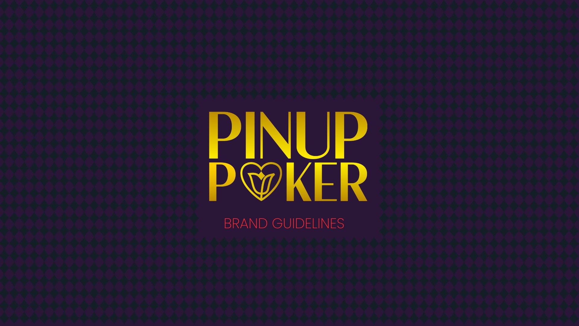
Pinup Poker is a game currently in development that combines classic poker mechanics with flirtation-based gameplay. The team needed a visual identity that could support the game’s pitch deck and help communicate the tone of the project before the product was fully built.
The challenge was to create a brand that felt seductive without becoming cliché, playful without feeling cheap, and bold enough for a poker audience while still being elegant and appealing to women.
The Challenge
The original world of the game was inspired by Art Deco: elegant, theatrical, slightly mysterious, and visually rich. At the same time, the developers wanted the identity to feel modern enough for a digital game and flexible enough to expand into different settings or “worlds” in the future.
The logo needed to balance several ideas at once.
It had to feel connected to poker, but not look like a generic casino brand. It had to suggest flirtation and intimacy, but in a tasteful and inclusive way. It had to appeal to men without being designed only through a male gaze. And it had to work as part of a broader pitch deck, including typography, color palette, and supporting graphic elements.
The Approach
We built the visual direction around a contrast between elegance and boldness.
The Art Deco influence gave the brand its sophistication: strong geometry, theatrical proportions, and a sense of nightlife mystery. To avoid making the identity feel too vintage or locked into one specific era, we paired that with a more modern color palette and a flexible graphic system.
The result is a brand world that feels premium, seductive, and adaptable. It supports the current poker and flirtation concept while leaving room for future expansion into different settings, characters, and visual worlds.
The Logo
The final logo uses a bold custom wordmark with a central symbol replacing the “O” in “Poker.” That symbol combines three key ideas: a heart, a flower, and a poker suit.
The heart represents attraction and emotional tension. The poker suit keeps the identity connected to the core game mechanic. The flower adds elegance and softness, but it is also more than a visual flourish: within the game, flowers represent the level of intimacy between characters. The more flowers appear, the deeper the relationship becomes.
This made the symbol especially important. It allowed the logo to connect directly to the gameplay system, rather than simply decorating the brand. The mark suggests seduction, progression, and emotional connection without relying on obvious or cliché adult-game imagery.
Color and Typography
The color palette combines deep purple, near-black tones, warm cream, vivid red, and gold. Gold was an essential part of the direction from the beginning. Because the game’s original world was inspired by Art Deco, the palette needed to carry some of that sense of glamour, luxury, and theatrical elegance. In Art Deco design, gold often evokes richness, nightlife, ornamentation, and visual drama, which made it a natural fit for the atmosphere of Pinup Poker.
The deep purple and near-black tones add mystery and sensuality, while the cream softens the palette and gives it a more refined, editorial feel. The vivid red brings energy, desire, and tension, helping the identity feel bold and game-ready rather than overly nostalgic.
Together, these colors create a world that feels mysterious, premium, and theatrical, while still having enough contrast and energy for a game interface, pitch deck, and future promotional materials.
The typography direction follows the same balance: elegant and stylized for the main identity, cleaner and more modern for supporting communication. This gives the brand a distinctive personality without limiting how it can be used across decks, screens, and marketing assets.