From Brand Crisis to Back in Business
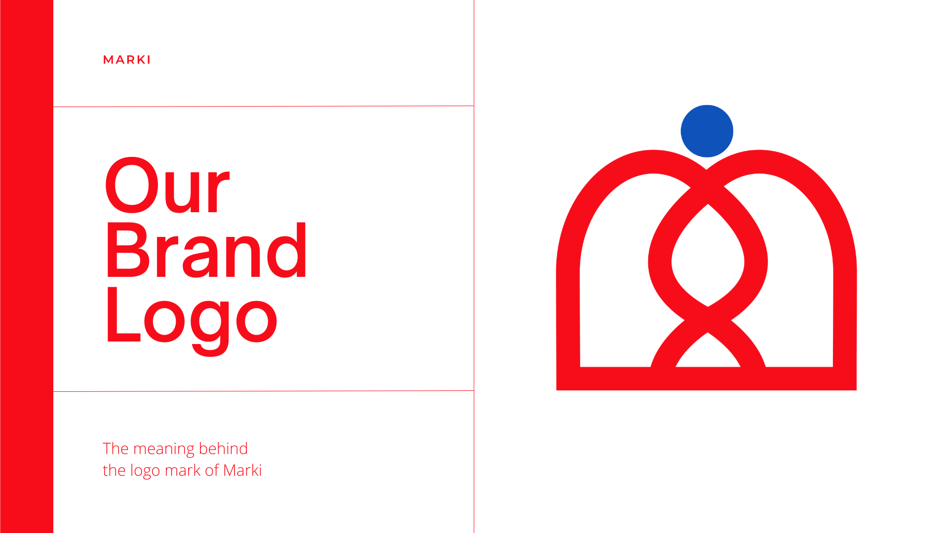
Marki was a longevity-focused nutrition startup founded by two French entrepreneurs who aimed to merge dietary science, DNA research, and personalized nutrition to improve long-term human wellbeing. Although early in development, the founders had already begun gaining traction around their science-forward mission when they discovered that their original company name infringed on an existing trademark.
To avoid legal exposure, they were required to pause all sales, marketing, and public-facing activities immediately. This sudden and unexpected disruption carried significant risks:
- Revenue loss during a critical early-stage period
- A forced halt to customer acquisition and product rollout
- Damage to early momentum and perceived legitimacy
- Operational delays and supply chain interruptions
The company’s operations remained frozen until a fully developed new brand identity could be created and deployed. Because the business had limited time and runway, the rebrand needed to be executed with extreme speed.
Despite the urgency, the founders were not seeking a placeholder or a quick fix, they needed a strategically grounded, symbolically meaningful identity capable of supporting their long-term vision if the company continued.
Velocity was essential, but so was depth.
The Challenge
Alongside the legal urgency, the creative brief was notably complex. The founders asked for a logo capable of integrating multiple symbolic elements into a single, cohesive mark that would express the essence of the company’s mission and heritage.
The final logo needed to simultaneously represent:
- Two founders, mirrored or reflected through form
- The colors of the French flag, to ground the brand in its origin
- A DNA motif, signifying the scientific foundation of the mission
- A recognizable “M” shape for the new name, Marki
- An infinite loop, symbolizing longevity and continuous improvement
- A subtle reference to the food and nutrition industry
- A symbolic touch of royalty or prestige, expressed with restraint
Each of these elements played a meaningful role in the brand’s narrative. The challenge was to merge them into a single visual form without creating a cluttered or overly literal design.
Adding to the complexity: the symbol needed to remain clear and impactful at very small sizes (e.g., app icons, social avatars).
The entire identity system, including colors, typography, spacing, variations, and usage rules, had to be complete and deployment-ready within seven days.
This required rapid conceptual exploration, precise geometric construction, and a disciplined approach to identity architecture, all under severe time constraints.
The Solution
We delivered a comprehensive brand identity system that met both the symbolic complexity and the urgent one-week timeline.
Instead of treating each requested element as a separate visual component, we approached the logo as a single integrated system. Through rapid conceptual iteration, we identified geometric relationships and symbolic overlaps that allowed multiple meanings to coexist within one clean form.
This approach produced a mark that feels intentional rather than over-engineered, balancing scientific precision with a premium, heritage-inspired aesthetic. The resulting logo reflects the founders’ story, mission, and cultural background in a way that is cohesive, elegant, and immediately recognizable.